

Fonts Keyboard
Fonts Keyboard
I installed Fonts Keyboard expecting a simple way to change the look of messages, but it is better understood as a personalization app built around the keyboard itself. It combines decorative type styles, symbols, emoji, and sticker-oriented tools inside the place where I already write, so the main appeal is convenience rather than deep customization. If you enjoy making captions, chats, comments, or profile text look different without switching between several apps, it is an easy one to understand.
My experience was mixed in a useful way. The app is playful, approachable, and broad enough for casual creative typing, yet the extra choices can also make the keyboard feel busier than a standard one. I would recommend it to someone who regularly wants eye-catching text and does not mind exploring a crowded selection of styles. I would be more cautious with it for people who want a quiet, highly efficient keyboard for work, accessibility, or serious multilingual typing.
How Fonts Keyboard feels in everyday use
Fonts Keyboard comes from Fonts Keyboard and sits in the personalization category. It is free to install, aimed at Everyone, and supports devices running Android 6.0 or later. That makes it accessible across a wide range of phones, although compatibility on an older device does not automatically mean the experience will feel equally smooth on every model.
The central idea is straightforward: open a text field, bring up the keyboard, and choose a visual style or special character while writing. Instead of composing in a separate font editor and then copying the result, I can make the change during the conversation or while preparing a short social post. That shorter workflow is the strongest reason to use it.
In a normal day, I can imagine using it for a birthday message, a playful group-chat reply, a short gaming nickname, or a social caption that needs more personality than plain text. The difference is especially noticeable when the message is brief. A few styled words can create an atmosphere without requiring a full image or elaborate design.
Related News

Why WhatsApp Messenger Still Makes Everyday Communication Feel Easy

Jurassic World: The Game Is the Better Dino Tycoon for Strategic Players

Threads in Real Life: Who Should Join, Lurk, or Leave

How SHEIN Turned Shopping Into an Endless Content Feed

How to Make Fortnite Feel Smarter on Mobile

Should You Switch to Microsoft Outlook on Mobile?
The keyboard is also useful when I want symbols that are inconvenient to locate in a conventional layout. Decorative punctuation, unusual letter forms, and expressive characters can help create a particular mood. I found this more practical than the sticker side of the app, because symbols remain part of the text and can be edited directly.
That convenience has a trade-off. A font that looks attractive in the selection screen may be less readable once it appears in a busy chat. Some stylized characters can also behave differently across services or devices. I would therefore use decorative styles for headings, emphasis, or short phrases rather than converting an entire long message.
My workflow for choosing a style without slowing down
I got better results by treating the app as a small finishing tool instead of leaving a decorative style active all the time. I write the message normally first, decide which words deserve emphasis, and then apply a style only to that portion. This keeps the text understandable and avoids the common problem of making every sentence compete for attention.
Gallery
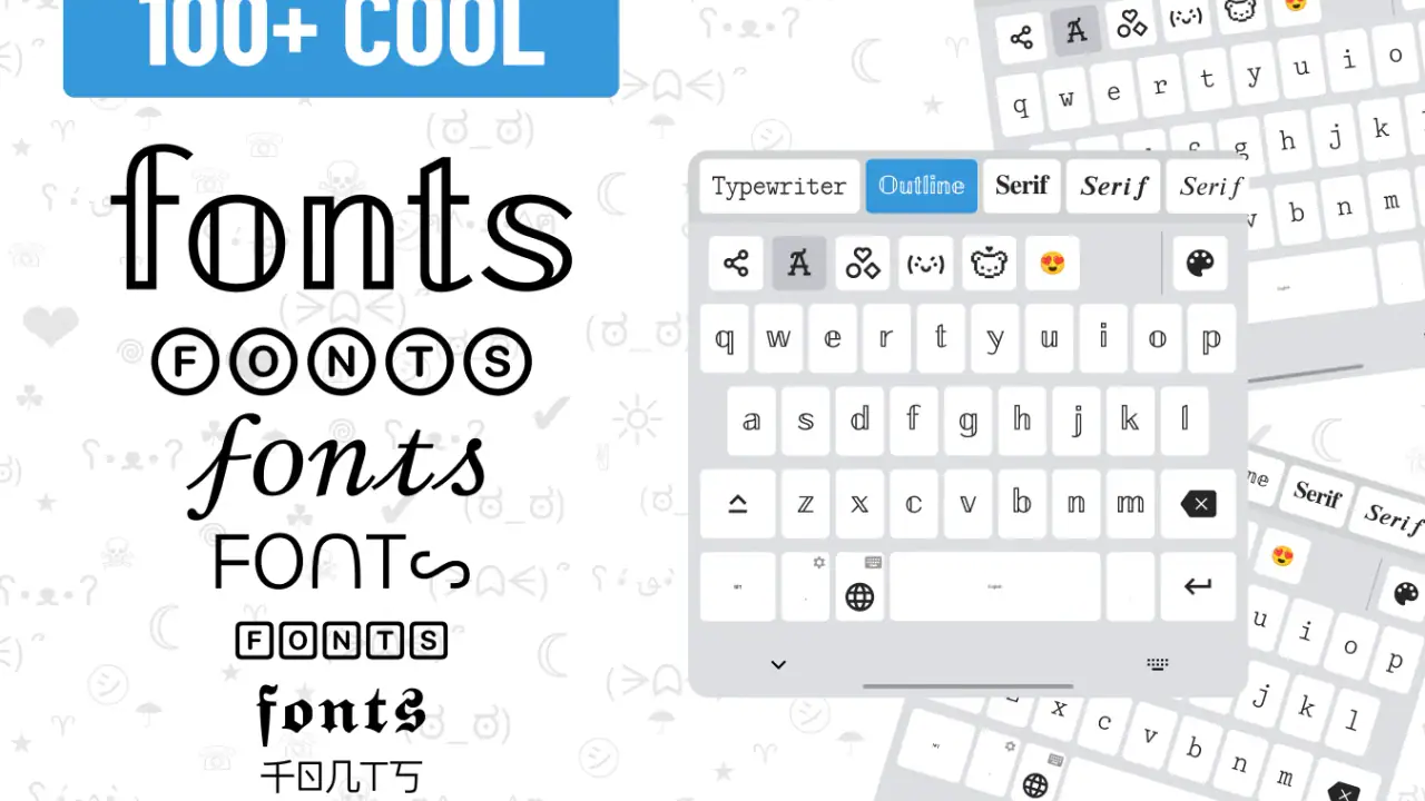
For recurring situations, I would keep a small personal set of dependable styles: one readable option for everyday chats, one more playful choice for celebrations, and one symbol-heavy option for short status text. This is more efficient than browsing every time. The app offers variety, but variety is most useful when it supports a routine rather than interrupting one.
Another practical habit is to send a test message to myself before posting something important. This helps reveal whether the selected characters remain legible in the target app. It is particularly worthwhile for usernames, invitations, public comments, or text that needs to be understood quickly.
The keyboard can be fun for expressive writing, but I would not treat it as a replacement for a professional writing keyboard. Standard alternatives usually win for fast correction, predictable autocorrect, and a calm layout. Fonts Keyboard wins when appearance matters more than typing speed.
Where the symbols, emoji, and stickers fit
The symbol collection is the most flexible part for me because symbols can be mixed with ordinary writing. I can frame a short phrase, separate parts of a caption, or add a visual cue without leaving the keyboard. This is a small feature, but it changes the app from a font switcher into a broader text-decoration tool.
Emoji serve a different purpose. They are faster than searching for a decorative typeface when the goal is simply to show emotion or reaction. I would use them when a message needs warmth or clarity, while reserving styled text for a particular visual identity. Mixing both can work, but too much decoration makes the message harder to scan.
Stickers are more situational. They suit casual conversations where a large visual reaction is welcome, but they are less useful for concise comments, formal messages, or text that needs to remain searchable. I see them as an optional layer rather than the reason to install the app.
A realistic example would be planning a friend’s birthday in a group chat. I might write the details in the normal keyboard so the date, location, and instructions remain clear, then add a decorative greeting and a few symbols around the celebratory part. That balance gives the message personality without hiding the information people need.
What the current version adds to the overall experience
The current version is 5.0.81.51948, and the app has been available since August 21, 2019. Those details place it in a mature product stage rather than an experimental launch. In practical terms, I would expect the focus to be on maintaining a large, familiar personalization toolkit instead of radically changing the basic concept.
The app’s reach also suggests that its core idea is easy for many people to understand: it has passed 100 million installs, with an average rating of 3.9 from around 1.3 million ratings. I would not read that score as a guarantee of a perfect experience, but it does indicate that the app has attracted substantial real-world use while leaving room for criticism.
Its current form feels designed for breadth. There are several ways to decorate text, and that makes the first session engaging. The downside is that a broad collection can feel less focused than a keyboard designed around speed or privacy-conscious minimalism. The evolution appears to have favored adding expressive possibilities, which benefits creative users more than people who want the smallest possible keyboard.
In-app purchases range from $0.49 to $29.99 per item. Since the app is free to install, I can try the basic experience before deciding whether extra content is worth considering. My advice is not to buy anything immediately. First, I would check whether the included styles already cover the occasions I care about and whether the keyboard fits comfortably into daily typing.
What existing users may notice after updating
For someone who has used Fonts Keyboard for a while, a newer version can matter less because of one dramatic feature and more because of small changes in how the keyboard feels. A familiar layout, refreshed style selection, or altered placement of tools can affect muscle memory. I would spend a few minutes testing ordinary typing before judging the update based only on its visual presentation.
Existing users should also review their favorite styles after an update rather than assuming their previous routine is still ideal. A style that was convenient for short captions may be too ornate for regular conversation, and a once-useful symbol set may no longer match the way they communicate. The best way to evaluate the current release is to use it in the situations that originally motivated the installation.
I would pay special attention to three things: how quickly I can return to a normal layout, how easy it is to correct mistakes, and whether the visual tools remain out of the way when I am typing a long message. These checks say more about daily value than the number of available designs.
There is also a social compatibility question. A styled message can look different depending on where it is pasted or sent. Existing users who rely on decorative text for public profiles should keep a plain version of important information, especially names, contact details, or instructions. That is not a criticism unique to this app; it is a general limitation of unusual Unicode-style characters and platform-specific rendering.
Where it still falls short
The biggest weakness is the tension between creativity and efficiency. A standard keyboard is usually built to disappear while I type. Fonts Keyboard wants me to notice it, browse it, and make choices. That is enjoyable for a short message, but it can become friction when I am replying quickly or entering a long paragraph.
I also would not choose it as my first option for professional communication. Decorative text can look careless in a work email, customer message, application form, or school submission. Even when the recipient can read it, the style may distract from the content. For those situations, a conventional keyboard remains the safer choice.
People who depend heavily on autocorrection, rapid gesture typing, or a very specific language workflow should test those habits carefully. Fonts Keyboard’s main identity is visual personalization, so it is reasonable to expect a different balance from a keyboard whose primary purpose is speed. If typing accuracy and low distraction come first, a familiar system keyboard may serve better.
There is a similar issue for accessibility. Larger, clearer, more predictable keys may be more important than decorative options for some users. The Everyone age rating describes the intended audience broadly, but it does not mean the visual density will suit every person. I would judge the keyboard by comfort, contrast, and error rate on the individual phone rather than by the age label alone.
Another limitation is that the app’s appeal depends on novelty. The first exploration can be entertaining, but if I rarely send styled messages, the keyboard may not earn a permanent place in my setup. In that case, a lightweight font generator used only when needed could be a better fit, provided it handles the specific text-sharing workflow I want.
Privacy and permission decisions I would make carefully
Because this is a keyboard, I would take the setup process seriously and read every system prompt before enabling it. A keyboard operates in a sensitive part of the phone, so I would not activate any input method casually. The right choice depends on personal comfort, the device’s settings, and the explanations shown during installation.
I would also avoid typing highly sensitive information with any third-party keyboard unless I had reviewed its behavior and was comfortable with the arrangement. Passwords, banking details, private identification numbers, and confidential work material deserve extra caution. For those moments, I would switch back to a trusted system input method if possible.
This does not cancel out the app’s usefulness. It simply means the personalization benefit should be weighed against the responsibility that comes with adding a keyboard. I would install it for expressive writing, keep a standard keyboard available, and make switching between them part of my routine.
Who should install it, and who should skip it
I think Fonts Keyboard is a good match for people who use messaging and social apps as a form of self-expression. It suits users who enjoy changing the tone of a short message, building a recognizable style for captions, or adding symbols without opening a separate editor. Younger users may appreciate the playful side, while adults can still find practical value in quick visual emphasis.
It is also worth considering if you manage several casual communities or group chats and want different visual treatments for announcements, celebrations, or recurring themes. The useful trick is to keep the information plain and decorate only the framing. That produces a clearer result than turning every word into an ornate character.
I would skip it if my priority were the fastest possible typing, minimal screen clutter, or a keyboard that stays visually neutral. I would also hesitate if I rarely customize messages, because the extra controls would add complexity without solving a real problem. For formal writing, accessibility-first typing, and sensitive data entry, another keyboard is likely the more sensible default.
What I would watch as the app continues
With a mature release such as 5.0.81.51948, I would watch how well the app balances its large creative identity with everyday usability. The important question is not simply whether more styles appear. I would rather see the selection process become quicker, the path back to ordinary typing remain obvious, and the keyboard avoid getting in the way when decoration is not needed.
I would also look for continued attention to compatibility. Stylish characters are only valuable when recipients can read them, and stickers are only useful when they fit the services where people actually communicate. A strong future direction would preserve the playful tools while making it easier to choose formats that travel reliably across apps.
For paying users, the value of optional purchases should be judged by repeated use rather than by the size of the catalog. If I use one style every day, a modest purchase may feel worthwhile; if I browse once and return to a standard keyboard, it is not. The free starting point makes that decision easier because I can test the workflow before spending money.
My final view is that Fonts Keyboard is most successful when I use it selectively. It adds personality to short writing, makes symbols easier to reach, and turns a routine keyboard into a small creative tool. It is not the best universal keyboard, and I would not replace a reliable standard option without testing my own typing habits first. But for casual messages, captions, celebrations, and expressive profiles, it offers enough variety to justify trying the free version. The key is to use its decoration as an accent, not as a barrier between the reader and what I am trying to say.
FAQs for Fonts Keyboard
What is Fonts Keyboard, and what can it do?
Fonts Keyboard is an application that enhances your typing experience by offering a variety of unique and stylish fonts. It allows you to easily switch between different font styles while typing in any app, making your messages and social media posts stand out. The app is compatible with most Android and iOS devices.
Is Fonts Keyboard free to use, or are there in-app purchases?
Fonts Keyboard is free to download and use, offering a selection of fonts at no cost. However, it also includes in-app purchases for premium font styles and additional features. These purchases can enhance your experience by providing more customization options. Be sure to check the app store for any current pricing details.
How do I install and activate Fonts Keyboard on my device?
After downloading Fonts Keyboard from the Google Play Store or Apple App Store, you need to enable it in your device's settings. Go to Settings, then 'Language and Input' on Android, or 'Keyboard' on iOS. Select Fonts Keyboard and follow the on-screen instructions to activate it as your primary keyboard.
Is Fonts Keyboard safe to use?
Fonts Keyboard is generally safe to use, but like any app that requests keyboard permissions, it can potentially access the text you type. It's important to download the app from reputable sources like Google Play Store or Apple App Store to ensure it has been vetted for security. Always review permissions and privacy policies before installing.
Will Fonts Keyboard work with all my apps and messaging platforms?
Fonts Keyboard is designed to work with most apps and messaging platforms, including social media apps like Instagram, Facebook, and WhatsApp. However, some apps may have restrictions or compatibility issues, which could affect how the fonts appear. If you encounter any problems, check for updates or contact customer support for assistance.
Pros
- Wide variety of stylish fonts available.
- Easy to switch between fonts quickly.
- User-friendly interface for beginners.
- Compatible with most social media apps.
- No subscription required for basic features.
Cons
- May slow down typing speed slightly.
- Some fonts require in-app purchases.
- Occasional ads can be intrusive.
- Limited customization options for fonts.
- Not all fonts support special characters.


